
| Display Value | Starts New Line? | Width/Height Settable? | Example Elements |
|---|---|---|---|
block |
Yes | Yes | |
inline |
No | No | |
inline-block |
No | Yes | Custom buttons, images, icons |
6. What does box-sizing: border-box do? (Medium)
By default, CSS uses the content-box model, which means that width and height only apply to the content, excluding padding and border. box-sizing: border-box changes this so that width and height include the padding and border, making sizing more predictable.
Here’s an example of how that might be demonstrated in CSS:
/* Apply border-box sizing to all elements and their pseudo-elements */
*,
*::before,
*::after {
  box-sizing: border-box; /* Width and height now include padding and border */
}

/* Demo: Without border-box (the default, content-box) */
.box-content {
  box-sizing: content-box;
  width: 200px;
  padding: 20px;
  border: 4px solid #2563eb;
  background: #f0f4ff;
  margin-bottom: 16px;
  /* The real rendered width will be: 200px (content) + 40px (padding) + 8px (border) = 248px */
}

/* Demo: With border-box */
.box-border {
  box-sizing: border-box;
  width: 200px;
  padding: 20px;
  border: 4px solid #16a34a;
  background: #e7faed;
  /* The rendered width will be exactly 200px, since padding and border are included in the width */
}
With border-box, you avoid the classic issue where adding padding or a border makes your boxes overflow their parent or break your layout. It’s now a standard best practice. You can even say that Chris Coyier has deemed February 1 “International box-sizing Awareness Day” which totally should be a real thing.
7. How would you go about making an image responsive in CSS? (Medium)
This is a deceptively hard question because responsive images is a topic big enough for an entire guide. The classic approach is to ensure that photos never exceed the width of their container. For most cases, that means setting a max-width on the image element and ensuring it maintains it’s proportions:
/* 1. Make images responsive to their container width */
img {
  max-width: 100%; /* Prevents the image from overflowing its parent */
  height: auto; /* Maintains aspect ratio */
  display: block; /* Removes bottom whitespace that inline images have */
}
For images that need to maintain a specific aspect ratio (like a 16:9 video thumbnail), you can use the padding-bottom trick:
/* 2. Maintain a specific aspect ratio (e.g., 16:9) using the padding-bottom trick */
.responsive-img-container {
  position: relative; /* Needed for absolutely positioning the img */
  width: 100%; /* Full width of the parent container */
  padding-bottom: 56.25%; /* 16:9 aspect ratio (9/16 = 0.5625) */
  overflow: hidden; /* Ensures image doesn’t overflow container */
}

.responsive-img-container img {
  position: absolute; /* Take the image out of the normal flow */
  top: 0;
  left: 0;
  width: 100%; /* Stretch to fill container */
  height: 100%; /* Stretch to fill container */
  object-fit: cover; /* Ensure the image covers the area, cropping if needed */
}
Modern CSS also has the aspect-ratio property for this:
/* 3. Use the aspect-ratio property for a cleaner approach (modern browsers) */
.aspect-ratio-img {
  aspect-ratio: 16 / 9; /* Maintain 16:9 ratio automatically */
  width: 100%;
  height: auto;
  display: block;
}
Responsive images often use the HTML srcset attribute and the
8. How would you make CSS more performant? (Hard)
CSS performance is crucial for delivering fast and smooth experiences, especially on large-scale websites or applications. Poor CSS practices can slow down page loads, increase rendering times, and make maintenance harder. There are several strategies you can use to keep your CSS efficient and your site responsive.
At the same time, CSS is often not the source of performance bottlenecks. It certainly contributes to it, but performance is a more nuanced field where many factors most certainly influence performance than CSS.
1. Minimize your bundle size
Large CSS files slow down initial page loads. Removing unused CSS (also called “dead code elimination”) can significantly reduce file size. Tools like PurgeCSS, UnCSS, or the built-in features of frameworks like Next.js and Tailwind can scan your HTML/JSX and only keep styles that are used.
2. Split and lazy-load CSS
Instead of shipping all CSS at once, split your styles by page or feature (“code splitting”). Modern bundlers (such as webpack and Vite) and frameworks (like React, Vue, and Next.js) support the dynamic import() feature, allowing only the CSS required for the current route or component to be loaded.
// Dynamically load styles when the page loads
import("./styles/page.css");
This technique improves “first paint” times and reduces bandwidth, especially for users who never visit certain pages.
3. Use simple, shallow selectors
Browsers read CSS from right to left and evaluate deeply nested or complex selectors more slowly. For best performance, use flat selectors like .btn instead of something like .header nav ul li a.active.
4. Minify and compress CSS
Before deploying, always minify your CSS using tools like cssnano or clean-css. Gzip or Brotli compression (handled by your server or CDN) will further shrink the payload sent to users.
5. Use critical CSS (or not!)
Critical CSS refers to inlining the minimal CSS required for above-the-fold content in the initial HTML. This allows the browser to render the visible part of the page immediately, while loading the rest of the CSS asynchronously.
I’d say this is a nice-to-have sort of thing, as it is a fragile and difficult strategy to implement and maintain.
6. Reduce the use of expensive properties
Specific CSS properties, such as heavy box shadows, filters, or animations on significant elements, can cause “repaints” and slow down rendering. Use these effects thoughtfully, and prefer transform and opacity for animating elements — the browser’s compositor can often optimize these.
7. Avoid !important and overly specific selectors
Frequent use of !important and particular selectors can make your CSS hard to override and debug, leading to more duplicated or conflicting rules.
8. Optimize unused CSS
Let’s face it. As a site is iterated, CSS often becomes larger, not smaller. Styles that were relevant at one point are superseded by new ones without fully replacing the older styles, often for fear of introducing unexpected changes in unknown places.
We have lots and lots of tools for detecting and removing unused CSS. There are limitations and possible trade-offs, of course, so your mileage may vary.
There there’s the case of UI kits or component libraries that import numerous unused styles. It’s easy (and maybe even tempting) to use all of the styles provided by a framework, but try importing only what you need, or use tree-shaking to strip unused parts. Many frameworks allow you to configure exactly what you need, like Bootstrap does.
10. Audit CSS regularly
Modern browser DevTools (like Chrome’s Coverage tab, Performance panel, and Rendering panel) let you see which styles are used on a page, helping you identify and remove dead code.
There are online tools as well, like the Specificity Visualizer, CSS Specificity Graph Generator, and CSS Stats. You can find more information on these and more in “Tools for Auditing CSS”.
9. What are the pros and cons of CSS-in-JS vs. external CSS imports, and which would you choose? (Hard)
CSS-in-JS may not be the hot topic it was a few years go, but you’re still very likely to see it pop up in an interview. It’s not so much your duty to rail for or against it, but demonstrate your understanding of the concept and how it compares to external CSS imports.
Here’s how I would break it out.
CSS-in-JS (like styled-components, Emotion, or Stitches)
| Pros | Cons |
|---|---|
| Styles are scoped to components, preventing unwanted side effects. | Adds runtime overhead and may increase JS bundle size. |
| Dynamic styling based on component state or props. | Styles may not appear immediately on server-rendered pages without extra setup. |
| Easy to maintain styles close to your component logic. | It can be harder to debug in the browser inspector. |
External CSS imports (classic .css files, global or CSS Modules):
| Pros | Cons |
|---|---|
| CSS is loaded by the browser in parallel, allowing for faster rendering. | Risk of style collision in global CSS. |
| Easier to cache and split CSS for large projects. | Less dynamic—harder to do conditional styles based on state. |
| Great for global themes, resets, or utility classes. |
In practice, most modern teams use a combination of global styles and resets in CSS files, along with component-level styles using CSS-in-JS or CSS Modules.
10. Can you build this layout in CSS? (Hard)
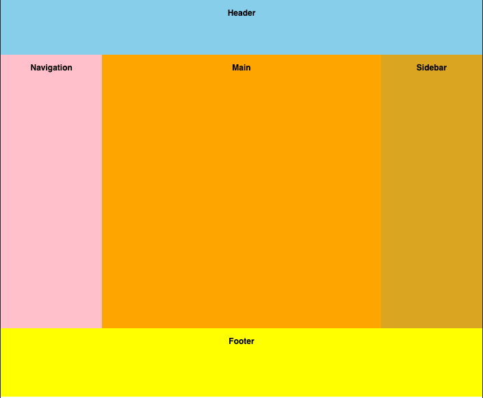
You’ll almost always be asked to build layouts on the fly.
Remember, a question like this is a great opportunity because there’s more than one way to solve it. In this case, we’re looking at a pretty classic “Holy Grail” layout, something Geoff has written about before and demonstrated various ways to go about it using CSS Grid.
You could go with a Flexbox approach as well:
It would be easy to fall into the trap of finding the “best” solution, but this perhaps is one case where demonstrating how to think like a front-end web developer is equally, if not more, important than coming up with a single definitive solution.
Conclusion
These are merely example of the sort of core CSS questions you’re likely to encounter in front-end interviews, along with practical examples and the reasoning behind each approach. If you’re comfortable answering these in depth and can code out the examples under time pressure, you’ll be well-prepared.
For more front-end interview questions, consider exploring frontendlead.com, which helps you prepare for front-end interviews across top tech companies. If you have additional topics you’d like to see covered or encounter tricky interview questions, please feel free to post them in the comments — I’d love to see them.
And, of course, best of luck in your interviews!